For the Workplace Light Design
project, we were required to research an interesting light design used in an
office space. For this, I found the Pons + Huots office in France. In this
space, the transformed an atrium space into a workspace with individual desks
and large trees surrounding them. This unique space uses light to enhance the
office and found a way to make work more fun. This was a good resource for the
project and taught me a lot about what is required in a workspace and what
would be necessary. Case studies are important to the concept work for a
project and does a lot to help the designer know exactly what is needed in the
space by looking at a real life example. They should be done before the start
of any project and will help immensely when working later on the design.
Philosophy
As a student designer I believe that design should not only come from the mind, but from the heart as well. Interior Design has been a part of my life since childhood, allowing myself to learn and become passionate about the career. The combination of bold ideas and interesting patterns inspire my love for a modern and classic type of design. In the future, my plan is to graduate from the Washington State University Interior Design program, work for an interior design firm, and later pursue my own Interior Design business.
Wednesday, December 11, 2013
Boundary County Library Project
The
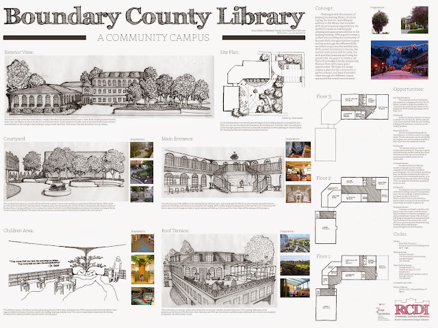
Boundary County Library project was a semester long assignment that was focused
in Bonners Ferry, Idaho. The community wanted to expand upon their current
small town library and design a 30,000 sq. ft. total building that would
include the library as well as shared spaces that could be at the use of any
person. These shared spaces include a wet lab, fabrication lab, digital technology
lab, commercial kitchen, classrooms, meeting rooms, storage, and maker spaces. Obviously,
this would require a well thought out plan and lots of detailed thought process
to come up with something that would make the community happy. Split into three
groups, the class was challenged with working with other classmates and come up
with three different designs. Working with the community was also difficult
because they were not quite clear with what they wanted. We had to try and come
up with something that we thought would fit them. Group B decided to stick with
a traditional design, cladding the exterior with brick and including arched
windows with flower boxes to give it that unique touch. With a large front
courtyard, the community would have a place where they could spend time outside
when the weather permitted and create a comfortable and distinctive aspect to
the design. The interior will include all of the spaces above as well as a
coffee shop and roof terrace, ensuring that visitors would feel welcome and
comfortable to relax and have the library feel like their own. Overall, this
design would be a great fit for the community and would be an exceptional
building for them to grow and learn in. Working in groups and with the
community was a great learning experience and taught the class a lot about what
it would be like to work in the real world with real clients.
Library Case Studies
When
working on a project, doing case studies as research beforehand is very
valuable. It helps you learn more about the project you are about to complete
and is a good starting point information wise. For the Boundary County Project
we were required to research four different case studies and create posters for
the information we found. These helped to understand what might be required in
a library and kick started the design process. It allowed us to think about
what we might need to include in terms of shelving, materials, storage, etc. I
would recommend using case studies as a form of research for your design
projects.
Atrium Workplace Light Design
Based on the Information Technology Building on our campus at Washington State University, this project used light and color to give an empty and windowless space life again. What was once a space open to the air, this atrium has since been covered and is a real eye sore to the overall building. The dark and drab room has windows opening up to about 20 offices and is a real depressing view for those employees. The goal of this project was to create a space where employees and visitors could spend their time and have a place where they wanted to be. Using light and color, this space was transformed from dark and empty to lively and bright. Working with the employees of the building, it was possible to see what they really wanted and also gave us great experience for working with real life clients. The space will include two lighting designs, two seating areas, and a coffee shop. This will transform the place and attract all kinds of people into the space. The two lighting designs used were reflection and diffraction. I used old fashioned bulbs hanging from the ceiling over a reflective pool of water to enhance the space and create a sparkling, unique aspect to the entrance. The other lighting design was used on the entrance wall where you can see the WSU logo is back lit with light seeping over the edges, using diffraction. With will lure people in and will cause curiosity to see what is behind that wall. The entire design is meant to be comfortable and functional to its users. This was a nice project and gave me more experience working with light.
Subscribe to:
Comments (Atom)


