Friday, December 7, 2012
One Bedroom Apartment and Common Area
For the final part of the St. Elmo hotel project, I have designed the one bedroom apartment and the common area. The inspiration for my design stems from the song, "The House that Built Me", by Miranda Lambert. In this song she talks about here memories of the house that she grew up in and how she will never forget that house. Using this, I wanted to create a space that will feel like a home and provide you the chance to create your own life long memories. With apartments, it can be difficult to personalize the space due to the wall color or random, outdated features. Using gray walls and a traditional style in the bathroom and kitchen, I wanted to create a space in which an owner could personalize the space and make it into something of their own. The gray walls can match with any color and the traditional feel provides a design aspect that is widely liked. I wanted to create a place that you wont feel "stuck" with. These spaces are designed to allow you to personalize and create something that fits your style and needs. You are sure to create lasting memories in these spaces.
Saturday, December 1, 2012
Design Meeting
Over thanksgiving break, I met up with designer Shelli Nelson to review my apartment project with her. This was a great experience and allowed me to learn and improve my skills. Shelli gave me advice as to how I could improve my previous design. She recommended the vanity with cabinets in the bathroom of the two bedroom apartment and also helped me decide on how to incorporate the built in bench and revise my common area.I loved being able to collaborate and decide on what would be the best ideas to use. It was really helpful to hear a professionals thoughts and ideas about my work, it was a cool experience. In the future I know that I will now search for outside opinions on my projects to improve my work and help give ideas and input. This was a very great experience and I was thrilled with the outcome!
Monday, October 22, 2012
Two Bedroom Bathroom Design

Thursday, October 18, 2012
Habitat for Humanity
 |
| The Habitat for Humanity house and garage door that I painted! |
Monday, October 8, 2012
Ride, Don't Walk Exercise. Accessibility.
 |
| Trying to fit into the parking garage building entrance... |
 |
| Fitting into the accessible bathroom! |
Two Bedroom Kitchen Design
 |
| Kitchen Design: includes floor plans, elevations, cross section, and perspectives |
 |
| Materials for Kitchen Design |
 |
| Volumetric Model for Kitchen Design |
"This apartment is meant to feel like a home. Its purpose is to have each owner and visitor have a sense of comfort and warmth. A house should be one to create memories that will last a life time and this apartments neutral color scheme allows each and every person to feel welcome and inspired. Any owner can personalize this apartment to make it into their own. Its traditional and modern design adds to the historic building, creating the perfect open atmosphere. This home is sure to stay in your memories for a life time."
This was the first time I have ever done anything like this. All of the standard measurements are new to me and while i struggled a bit to figure the right things out, I am very proud of what I came up with. I am proud of myself for not procrastinating this job and using good time management skills. In the future I think that I need to research all of the measurements and requirements a bit more in order to get everything right. I put so much effort and time into this project and I believe that it shows. I am very proud of my work, even if I can improve some more in some areas, I can work on those in the future.
Showrooms and House of the Immediate Future
 |
| Barcelona Chair sketch from Knoll visit |
 |
| Sketch of bench outside of the House of the Immediate Future |
 |
| Quick sketch of the House of the Immediate Future |
 |
| Lighting from 3Form |
 |
| Rug and table from Knoll showroom visit |
Sunday, October 7, 2012
Urban Sketchers: Study Tour: Seattle

 |
| These are two of the sketches I did on the Sketch Crawl. I am proud of the effort I put into these sketches. |
CollinsWoerman Job Shadow: Study Tour
 |
| Swedish Hospital in Issaquah, WA. Award wining hospital designed by CollinsWoerman Architectural Firm. |
Tuesday, October 2, 2012
Color in Interiors

This week, I researched a case study and applied it to my topic, color in interiors. This was fun to study because I was allowed to research how color had an effect on different people. After researching I learned just how important color really is and how I can use it to better myself as an interior designer as well as how to make my client happy. I look forward to creating spaces that apply this technique!
Client Brief
After meeting with the client for the palouse hotel, I was able to get a good sense of the project and what was to be done. The St. Elmo hotel, located in Palouse, WA, is a historical
building first built in 1887. After years of many uses, the spot is being
renovated into a hotel/apartment complex. With eight separate spaces, the
project manager, has opted to create a place for both permanent residents
and temporary visitors. The overall feel of the hotel is to be somewhat of a
“green” place, using environmental friendly and recycled materials. The
separate living spaces are hoped to have a modern and balanced feel to them,
including the design that will allow each place to seemingly flow naturally, with
no effort. The plan is to have this historical, 125 year old building,
transform into an inviting, natural place for people to visit and live for many
more years to come.
Monday, September 10, 2012
Concept Development
The inspiration for my design stems from the song, "The House that Built Me", by Miranda Lambert. In this song she talks about here memories of the house that she grew up in and how she will never forget that house. Using this, I wanted to create a space that will feel like a home and provide you the chance to create your own life long memories. In my concept model, I used wood sticks and wire. I chose these items because a home is built out of various materials like wood and metal. With a knot in the wire, I wanted to display a memory. More specifically, a memory of your home, something that you will never forget.
Tuesday, May 1, 2012
Poster Design

This was my poster design for the designer Jonathan Adler. I created a room to think inspired by his work and concepts that i came up with. This poster includes a picture of my 3D concept model, my nature object inspiration, my object studies, concept statement, and all of my concept drawings/sketches. I had a good time creating this poster and I really enjoyed being able to make it into something unique and creative.
Tuesday, April 24, 2012
Negative Space

We were asked to draw a chair using only negative space. I enjoyed doing this sketch because it was something different and I found it interesting. I would like to do more sketches like this in the future so I can enhance my technique.
Fruit Cross Section
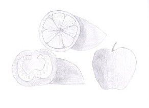
Here we were asked to draw the cross section of two pieces of fruit and a third to make a grouping. I likes doing this sketch because i thought it was cool to draw the cross section of the fruit. Normally you only see the outside, so it was cool to think of what the inside looks like.
Value Study In Line

This assignment was to draw a corner of a room and show how the light can cast shadows. One drawing shows the value of the space using line weight and the second shows the value change in the space using high contrast methods. I found this fun to do and I enjoyed drawing using the two different techniques.
Black Paper

This was a sketch assignment that asked us to sketch an architectural detail on black paper using colored pencils. I drew the molding in my dorm room using colored pencils which i found semi difficult due to the fact that you cant mess up when you are drawing on black paper with these pencils. Usually I find my self erasing a lot so it was hard not to have that option!
Room Corner

This was a sketch assignment to sketch a corner of the room using perspective. I sketched the corner of my dorm room and i found it fairly simple. With more practice and better technique i think i can really get the hang of drawing in perspective.
Keys

This assignment was to sketch our keys. This was our first sketching assignment and I think i did pretty well for my first drawing. I enjoy sketching objects more than people or houses so i enjoyed this one!
Figure Sketch

This assignment was to trace over a picture of a human who was walking, running or doing something active. For this I chose a little girl who was hopping on the beach. The tricky part was that we could only use single lines to create the figure. This was hard for me because i usually find myself drawing over my lines multiple times. I dont think this turned out too bad but I still trying to learn how to!
Tuesday, April 10, 2012
Logo

Tuesday, April 3, 2012
Textile Design

This was a textile design for my Interior Design 197 class. Using Photoshop and Indesign, I used pictures from an American Vernacular Design book to creativley piece together a textile pattern. This was a difficult project for me because i have trouble with Photoshop but I worked through that and I am proud and happy of my final product!
Thursday, February 16, 2012
Chair Views

Mind Map

A mind map is an outline in which the major categories radiate from a central image and lesser categories are portrayed as branches of larger branches. The technique is a form of word association that frees up the more creative, intuitive part of the brain. I enjoyed drawing this mind map because it allowed me to write and draw my thoughts on paper.
Cross Hatching Fruit Sketch

American Vernacular Design Pattern

Subscribe to:
Comments (Atom)